When you work on a product every day, it becomes familiar in ways your users never experience. Flows you know by heart can hide small moments of confusion. Labels that feel clear to you can leave new customers guessing. A UX design audit gives you a practical way to uncover these issues so you can support users and help them reach their goals with confidence.
UX research groups like Nielsen Norman Group describe a UX design audit as a structured look at how well an interface supports users. That structure helps you move past instincts and see the details that actually shape someone’s experience. This guide walks through what a UX design audit is, why it matters, and how you can run one without slowing your team down. You’ll also get a simple checklist you can reuse each time you need to assess a flow or screen.
By the end, you’ll have a method you can apply to any part of your product, whether you’re refining an in-progress design or reviewing a live feature.
Why UX Design Audits Matter
A UX design audit shows how well your product supports the tasks users need to complete. It reveals friction that affects their experience, whether it’s a confusing label, an unclear path forward, or a flow that doesn’t match their expectations. Acting on those findings helps you deliver improvements that make a measurable difference.
Product teams use audits to tie design updates to outcomes. A streamlined flow can reduce support requests. Clearer content can help more people finish setup. Small adjustments can strengthen conversion rates or reduce drop offs.
It’s also a helpful way to check in during key moments. Teams often run audits when metrics shift, before major releases, or after seeing repeated customer questions. A quick review can highlight the areas where attention will have the most impact.
A UX design audit doesn’t need to be large in scope. Even a focused look at one important flow can give you insights that guide your next round of improvements.
When to Run a UX Design Audit
A UX design audit works best when it’s part of your regular product rhythm. Many teams run audits at key moments, like after a release, before a major update, or when they notice shifts in their metrics. It’s also useful when support teams start hearing repeated questions about the same flow or feature.
You don’t need to wait for a problem to run an audit. A quick review during planning cycles or after design changes helps you spot friction early and keep the experience steady as your product grows.
How To Conduct a UX Design Audit
Running a UX design audit gets easier when you follow a simple structure. The goal isn’t to produce a huge report. It’s to understand what’s working, what’s getting in the way, and which improvements will help users the most. These steps give you a clear path from start to finish.
1. Set Goals and Gather Key Data
Start by defining what you’re trying to improve. Pick one flow or part of the product instead of the whole experience. This helps you stay focused and gives you clearer insights. Identify the users involved, the tasks they’re trying to complete, and the outcomes you want to support.
Once you know the scope, look at the data you already have. Analytics can tell you where people drop off or hesitate. Behavior tools can show common patterns, like repeated backtracking or abandoned steps. Customer support notes, survey responses, and user comments can reveal themes that fit with those patterns. Together, these clues point to the spots that deserve the closest look.
2. Evaluate Usability, Content, Accessibility, and Visual Clarity
Now that you know where to focus, review the experience screen by screen. You can use established usability heuristics, such as those outlined by Nielsen Norman Group, to keep your review consistent.
Here’s what to pay attention to:
- Usability
Check if the flow feels natural. Look for moments where users might pause, guess, or restart a task. Review labels, buttons, and form fields to make sure each one communicates what it needs to. - Content
Make sure the language is clear and helpful. Short, direct copy often works best. Look for jargon, vague instructions, or missing context that might slow someone down. - Accessibility
Confirm that text is easy to read, controls are reachable, and color contrast supports all users. Try navigating without a mouse or viewing the design at different sizes to see how it holds up. - Visual consistency
Check for consistent components, spacing, and hierarchy. Consistent design gives users confidence and helps them understand what actions are possible.
As an example, in one audit, a team noticed that new users stalled on the second step of onboarding. Session recordings showed people scrolling up and down repeatedly. The page asked for too much information at once, so splitting the form into two shorter steps helped more users complete the setup without hesitation.
As you review, capture examples of anything confusing or inconsistent. Screenshots and short notes help you see patterns and make it easier to share what you’ve found with your team.
3. Prioritize and Document Your Findings
A UX design audit works best when you turn your observations into a clear list of actions. Group related issues together and note how much each one affects the user. Focus on items that block key tasks or create repeated friction. This gives your team a shared picture of what needs attention first.
Create a short summary that includes your goals, your methods, and a prioritized list of findings. Include screenshots to show each example. Simple reports like this help teams stay aligned and reduce the guesswork that usually slows down improvements.
4. Apply Improvements and Measure Change
Once you’ve shared your findings, turn the top items into tasks your team can act on. After making updates, watch your metrics to see how the changes helped. You might revisit the same flow later as part of a regular product checkup.
UX design audits work well as a quick loop of review, improvement, and measurement. A simple checklist helps you keep that loop consistent each time you revisit a flow or evaluate a new one.
UX Audit Checklist
You can use this checklist for any flow or feature. It’s a quick reference that supports each step of your audit.
Experience Foundations
- The goal of the flow is clear for the team.
- The primary user and their task are defined.
- Success criteria or expected outcomes are documented.
Navigation and Task Flow
- Users can see where to start and where to go next.
- Tasks follow a logical order and give users a clear path forward.
- Key actions are easy to identify and complete.
Content and Messaging
- Labels and instructions are short, direct, and specific.
- Error messages explain the problem and what to do next.
- Content supports the user’s decision, especially at critical points.
Visual Clarity and Consistency
- Components follow consistent spacing, alignment, and behavior.
- The hierarchy on each screen guides attention in a predictable way.
- Interactive elements look actionable.
Accessibility Basics
- Text meets readable contrast levels.
- The flow works with a keyboard and without relying on hover-only states.
- Images, icons, or charts include helpful descriptions where needed.
Performance and Device Coverage
- Screens load quickly on common devices.
- Layouts respond cleanly across mobile and desktop sizes.
- Key tasks still work reliably when the connection isn’t ideal.
Evidence and Feedback
- Analytics and behavior data highlight friction points.
- Support themes or customer questions align with issues you found.
- Notes, screenshots, and examples are collected for your report.
A checklist gives you a reliable way to review your product, but the right tools can make each step faster and easier to execute.
Tools That Make UX Design Audits Easier
You can run a UX design audit with nothing more than notes and screenshots, but the right tools save time and help you spot patterns you might miss on your own. These categories cover the tools teams reach for most often when they’re reviewing a flow or interface.
Analytics and Behavior Tools
Tools like Google Analytics, Mixpanel, or Pendo show you where people drop off, hesitate, or stop interacting. Heatmaps and session recordings add helpful context by showing how real people move through a page. Together, these insights help you confirm which parts of the flow need closer attention.
Accessibility Checkers
Accessibility tools make it easier to confirm that your design supports a wide range of users. Browser extensions and built in checkers can flag issues with contrast, keyboard access, or semantic structure. Tools like WebAIM’s contrast checker or browser based Lighthouse reports are useful starting points when you’re reviewing a design with accessibility in mind.
If you want to explore accessibility guidelines in more depth, the WCAG standards offer an in-depth reference.
Prototype and Usability Testing Tools
If you want direct input from users, lightweight testing tools can help you gather quick feedback. They let you watch people attempt key tasks or answer short questions about clarity, expectations, and ease of use. These insights validate the issues you find during your audit and help you understand how real users experience the design.
Teams also use Centercode to share early concepts or interactive prototypes with target users. It’s a practical way to collect structured feedback that shows how people respond to your design before it reaches development.
Design Systems and Interface Guidelines
Design systems like Material Design and Apple’s Human Interface Guidelines offer clear examples of patterns, spacing, and component behavior. Reviewing your screens alongside a trusted reference can help you spot inconsistencies or areas where your component library might need updates.
AI Powered Design Feedback
AI tools can give you fast, structured feedback on a single screen or full flow. This helps you spot opportunities to improve clarity, accessibility, or visual consistency before you run user tests or share work with your team. Centercode’s Design Audit app fits into this category and can support the early stages of your review by highlighting issues and patterns you might want to explore further.
Tools can speed things up, but there are still a few easy mistakes that can throw your audit off track.
Common UX Design Audit Mistakes to Avoid
A UX design audit works best when it’s focused, consistent, and grounded in real user needs. These common mistakes can get in the way of that.
Skipping the Goal Setting
Jumping straight into evaluation without defining the user, task, or outcome makes it hard to understand what your findings actually mean. Clear goals give the rest of the audit direction.
Reviewing Too Much at Once
Trying to audit an entire product in one pass creates noise and hides the real issues. Start with a single flow or screen set so you can go deeper and produce next steps your team can act on.
Focusing Only on Visuals
Visual polish matters, but most problems come from unclear content, confusing navigation, or mismatched expectations. A strong audit balances visuals with usability, clarity, and accessibility.
Ignoring Evidence
An audit that relies only on intuition misses the full picture. Combine your screen review with data, support themes, or user feedback so your recommendations carry more weight.
Letting Findings Sit Unused
A list of issues doesn’t create change on its own. Turning findings into tasks with owners and success criteria makes your audit valuable and keeps your team aligned on next steps.
With these mistakes in mind, it’s helpful to have a reliable way to get an early read on your designs. That’s where Design Audit comes in.
Reviewing Designs With Design Audit
Design Audit is a free Centercode Labs app that gives you quick, AI powered feedback on your in progress or published designs. You can upload a single screen or a small set of mockups and get clear observations about usability, clarity, accessibility, and visual consistency.
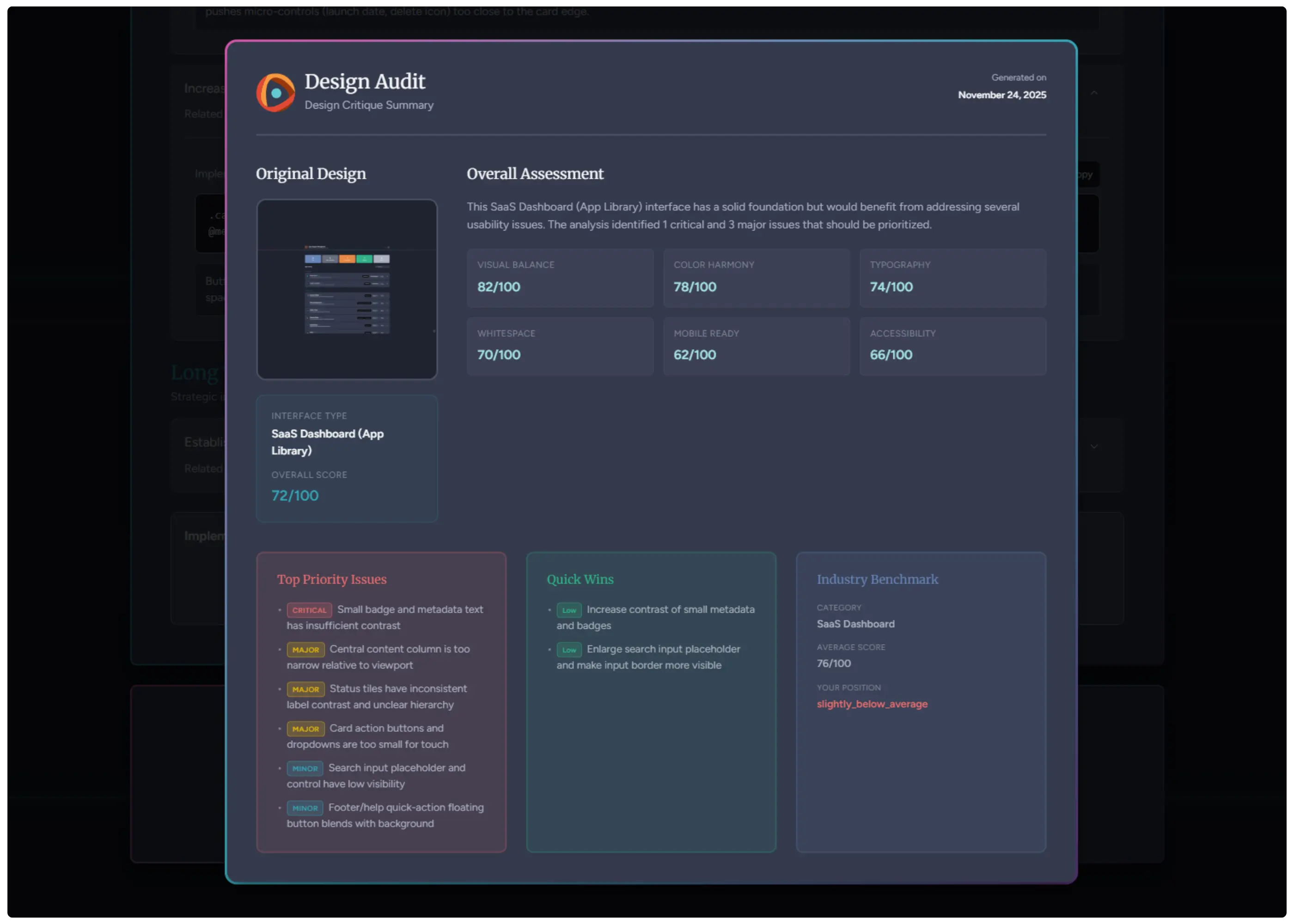
The app highlights potential issues, shows annotated hotspots, and summarizes patterns you might want to explore during your audit. It also provides modernization suggestions, scoring, and simple exports you can add to your notes or share with your team.
Teams use Design Audit when they want a fast second opinion that supports the early stages of a UX design audit. It’s an easy way to gather structured insights before you move on to deeper analysis or user testing.
Wrapping Up
A UX design audit gives you a clearer view of how people experience your product. With a focused approach, steady evidence, and the right support, you can uncover issues early and guide your team toward thoughtful improvements. Each audit builds a stronger understanding of what your users need and how your design can help them reach their goals.
If you want a simple way to start your next audit, try uploading a design to Design Audit. It’s a fast way to gather early insights you can build on as you refine your flow, test with users, or prepare a full review.